FAST: UI framework for the web
The work. FAST is Microsoft's open-source project for building adaptive, standards-based web components. I contributed to building and maintaining accessible components with React and Web Component technology, collaborating with design and engineering to own, build, and maintain Web Components across multiple Microsoft Edge web experiences using FAST and Fluent UI Web Components.
Scope
- Edge web experiences. Owned, built, and maintained Web Components for multiple Edge surfaces, working across design and engineering with FAST and Fluent UI Web Components.
- The FAST website. Contributed to creating
fast.designwhile leading a few interns. I built the navigation and section-header components. - High contrast, both libraries. Owned the high-contrast accessibility work for both the FAST and Fluent UI component libraries.
- Assistive-tech verification. Tested components in high contrast, keyboard navigation, and screen readers (VoiceOver, Narrator, and JAWS) against the patterns in the ARIA Authoring Practices Guide.
The FAST website
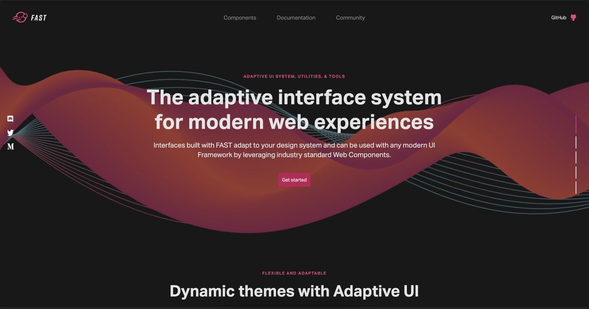
I contributed to building fast.design, the project's public face, while mentoring a few interns through their contributions. I owned the site navigation and the section-header components.
Accessibility in mind
My biggest contribution was owning the high-contrast work for both the FAST and Fluent UI libraries. I made sure components met accessibility standards by testing where it counts: in Windows high contrast, with keyboard-only navigation, and in real screen readers (VoiceOver, Narrator, and JAWS), building against the best practices and patterns of the ARIA Authoring Practices Guide.
Then I wrote it down: a guidance document to help the open-source community and internal partners build accessible components with high contrast in mind, so the standard didn't depend on me being in the room.
FAST, then and now
FAST has changed a lot since I worked on it, which is what you want from a healthy open-source project. The components I built shipped to Edge users, and I'm still on the contributor list.
What transfers
I test with actual screen readers, VoiceOver, Narrator, and JAWS, because automated checks miss most of what matters. High contrast is the kind of work many engineers avoid, and I ended up owning it for two libraries. I mentored interns while shipping. And I documented the accessibility guidance so the standard wouldn't depend on me.